It’s all being done “for our own good”. We must be forced to believe in using less fossil fuels. We must be forced to believe in giving more Billions to the UN for more studies even though that “Science is Settled”. We must be forced to accept higher costs for food and energy so we will consume less and produce less waste. What about those who literally die because they can’t afford it? What about the hypocrisy of saying “Trust Us?” When there ARE Scientists watching and saying LOOK AT THE FACTS.
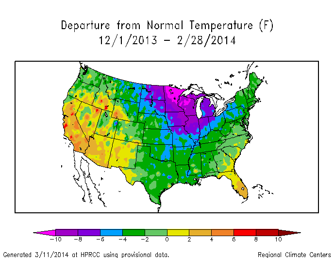
Despite record cold and Great Lakes ice, NCDC thinks they can get away altering the US temperature record to make the past winter just below average temperature.
It was actually the ninth coldest winter on record, and the coldest in 35 years.
NCDC bumped the winter up to 34th warmest, through an amazing 4 degrees of tampering relative to 1949.
These adjustments are about 5 times larger than what they show in USHCN documents.
[Anthony Watts pointed out that the HPRCC map above uses a different set of stations and different baseline period than the NCDC graph. This is a valid point and affects the 74% of US below normal I mentioned, but seems unlikely to account for more than a about half a degree difference in the regional anomalies.]
Almost Daily New Recognition of Deliberate Changes to the Temperature Records to MAKE it appear the Earth is Warming. Is There Human made CO2 Globalwarming? Fiddling with temperature data is the biggest science scandal ever – More experts and Journalists are simply looking at the raw measurements with astonishment compared to official claims of record warming.
The Hottest Year 2014 Claim is Biased on Sparse Global Thermometer Coverage since 1990, not supported by more accurate and complete Satellite Temperature Measuring.
In South America, there are hardly any rural land thermometers. GISS tells us the area is warming (see the map below). Paul Homewood looked at the raw data. There are only three rural stations currently operating in the area, Puerto Casado, Mariscal, and San Juan, and they all show a raw trend that falls. As in so many other situations, after adjustments, all three show a rising trend. The changes are breathtaking. In Mariscal raw temperatures of 25.5C turned out to be “really” 22.5C. (Those 1950 thermometers were hopeless 😉 ). In San Juan Bautista, and Puerto Casasdo the old thermometers get adjusted down by around two degrees. Perhaps there are reasons for the adjustments, but if old thermometers so so bad, and station changes have made such a difference, why does any scientist pretend we can calculate global temperatures accurately?
The GISS map of South America. Left: The warming. Right: The NOAA map showing “grey” areas with no coverage. See Notalotofpeopleknowthat for source links.
Paul Homewood describes what he found when he compared the raw data with the official set: Massive Tampering With Temperatures In South America. This is just one of his three graphs. They are all show similar transformations.
…
Christopher Booker discusses the implications in: Climategate, the sequel: ‘How we are STILL being tricked with flawed data on global warming’.
Although it has been emerging for seven years or more, one of the most extraordinary scandals of our time has never hit the headlines. Yet another little example of it lately caught my eye when, in the wake of those excited claims that 2014 was “the hottest year on record”, I saw the headline on a climate blog: “Massive tampering with temperatures in South America”
After telling us about Homewoods work, Booker describes how dubious so many of the surface temperature sets are:
One surprise is that the three surface records, all run by passionate believers in man-made warming, in fact derive most of their land surface data from a single source. This is the Global Historical Climate Network (GHCN), managed by the US National Climate Data Center under NOAA, which in turn comes under the US Department of Commerce.
But two aspects of this system for measuring surface temperatures have long been worrying a growing array of statisticians, meteorologists and expert science bloggers. One is that the supposedly worldwide network of stations from which GHCN draws its data is flawed. Up to 80 per cent or more of the Earth’s surface is not reliably covered at all. Furthermore, around 1990, the number of stations more than halved, from 12,000 to less than 6,000 – and most of those remaining are concentrated in urban areas or places where studies have shown that, thanks to the “urban heat island effect”, readings can be up to 2 degrees higher than in those rural areas where thousands of stations were lost.
To fill in the huge gaps, those compiling the records have resorted to computerised “infilling” or “homogenising”, whereby the higher temperatures recorded by the remaining stations are projected out to vast surrounding areas (Giss allows single stations to give a reading covering 1.6 million square miles). This alone contributed to the sharp temperature rise shown in the years after 1990.
But still more worrying has been the evidence that even this data has then been subjected to continual “adjustments”, invariably in only one direction. Earlier temperatures are adjusted downwards, more recent temperatures upwards, thus giving the impression that they have risen much more sharply than was shown by the original data.
The GISS group told the world 2014 was the hottest ever. Goddard Institute for Space Studies doesn’t use the satellites in space — they use thermometers on the ground, near airports and tarmacs, which need a LOT of man-made adjustments.
These datasets need independent replication. Analysts who want to find the flaws need to get the resources to replicate them properly. Anything less is not real science. Skeptics need funding.
Rating: 9.5/10 (140 votes cast)
Man-made adjustments transform cooling to warming in Paraguay, South America , 9.5 out of 10 based on 140 ratings
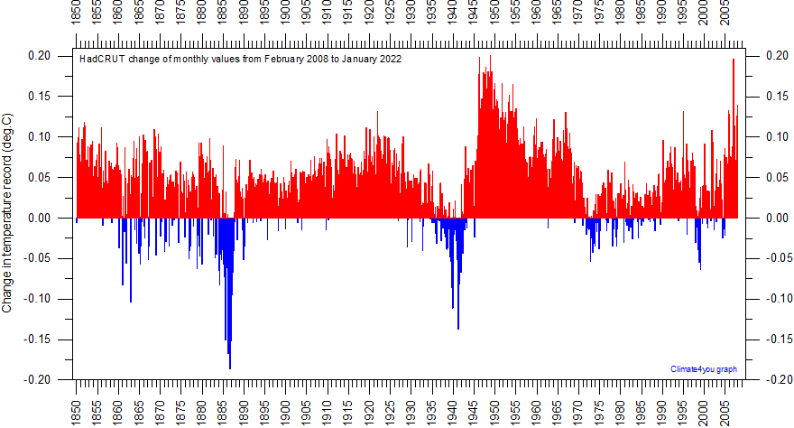
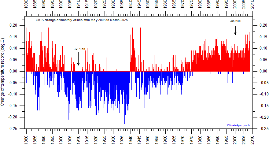
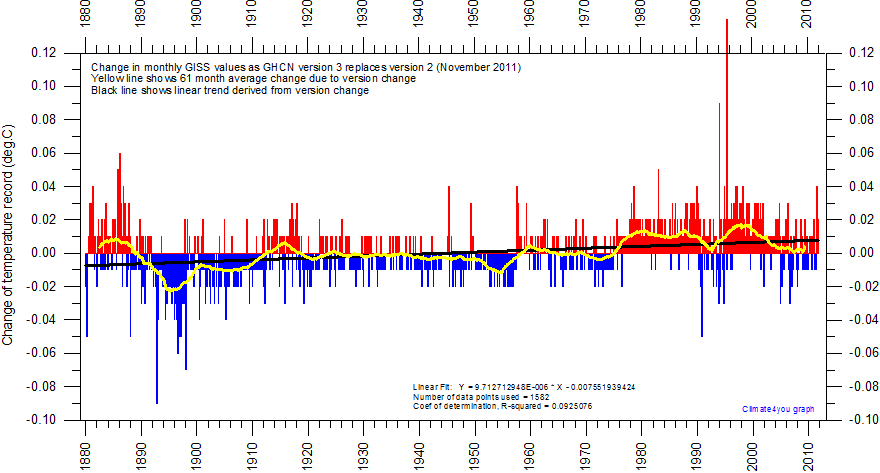
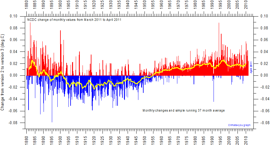
UK HadCRUT, US NASA GISS, US NCDC, AustraliaMet ALL Altered Their Temperature Data Records to Make Warming – See Graphs Here
Written by Paul Litely at Paullitely.com
These tweets link to a site that clearly shows with GRAPHS OF THE CHANGES MADE
how temperature records were and are manipulated all over the world. The early half of the 1900’s were made to look colder while the last half of the 1900’s are made to look warmer, right into the 2000’s. Peaks of warming in the past were clipped off. Troughs of cooling were also clipped off, all to create a warming trend, to suppress the effects of ocean El Ninos and La Mina’s, and to enable new “Record” High temperatures today. So now we can see how claims are made today that new record warm temperatures are happening…. when they are not. We can also see how the long straight handle of the “Hockeystick” IPCC graphs are made from past S curves. Their models cannot even predict the PAST. Who can you trust if they change the actual Raw measurements in an obvious slant to match their story?
Click on the links below to see how nearly all “Authorities” on temperature records have tilted or clipped their records to make warming that does not exist. Their patterns are obviously self-serving.
One justification given for making “Homogenizing” adjustments is because some thermometers used started out in open areas, but paving and buildings were added nearby. They call this the “heat island” effect, because replacing soil and greenery with Manmade structures adds heat. However, this would only justify LOWERING recent measurements to compensate. What we observe is lowering earlier measurements and raising recent measurements. That is opposite of the “Heat Island”effect, so is plainly arbitrary change to support their Global Warming agenda. Notably, there has been such scrutiny of recent measurements that this “Fudging” no longer can be done.
For current articles with more proof of misrepresentations of the raw measurements, go to my Twitter @paullitely to see more. A common technique today is to omit measurements of temperature and Ice and sea level, etc for the most recent years after 2012. Recent years trends have shown dramatic cooling Temperatures, and return of arctic ice to even above average. Severe warm weather weather event tornados and hurricanes have become much less common. This does not support the Global Warming agenda, so recent measurements are being delayed publication as long as possible.
Although it has been emerging for seven years or more, one of the most extraordinary scandals of our time has never hit the headlines. Yet another little example of it lately caught my eye when, in the wake of those excited claims that 2014 was “the hottest year on record”, I saw the headline on a climate blog: “Massive tampering with temperatures in South America”. The evidence on Notalotofpeopleknowthat, uncovered by Paul Homewood, was indeed striking.
Puzzled by those “2014 hottest ever” claims, which were led by the most quoted of all the five official global temperature records – Nasa’s Goddard Institute for Space Studies (Giss) – Homewood examined a place in the world where Giss was showing temperatures to have risen faster than almost anywhere else: a large chunk of South America stretching from Brazil to Paraguay.
Noting that weather stations there were thin on the ground, he decided to focus on three rural stations covering a huge area of Paraguay. Giss showed it as having recorded, between 1950 and 2014, a particularly steep temperature rise of more than 1.5C: twice the accepted global increase for the whole of the 20th century.
But when Homewood was then able to check Giss’s figures against the original data from which they were derived, he found that they had been altered. Far from the new graph showing any rise, it showed temperatures in fact having declined over those 65 years by a full degree. When he did the same for the other two stations, he found the same. In each case, the original data showed not a rise but a decline.
Homewood had in fact uncovered yet another example of the thousands of pieces of evidence coming to light in recent years that show that something very odd has been going on with the temperature data relied on by the world’s scientists. And in particular by the UN’s Intergovernmental Panel on Climate Change (IPCC), which has driven the greatest and most costly scare in history: the belief that the world is in the grip of an unprecedented warming.
How have we come to be told that global temperatures have suddenly taken a great leap upwards to their highest level in 1,000 years? In fact, it has been no greater than their upward leaps between 1860 and 1880, and 1910 and 1940, as part of that gradual natural warming since the world emerged from its centuries-long “Little Ice Age” around 200 years ago.
This belief has rested entirely on five official data records. Three of these are based on measurements taken on the Earth’s surface, versions of which are then compiled by Giss, by the US National Oceanic and Atmospheric Administration (NOAA) and by the University of East Anglia’s Climatic Research Unit working with the Hadley Centre for Climate Prediction, part of the UK Met Office. The other two records are derived from measurements made by satellites, and then compiled by Remote Sensing Systems (RSS) in California and the University of Alabama, Huntsville (UAH).
The adjusted graph from the Goddard Institute for Space Studies
In recent years, these two very different ways of measuring global temperature have increasingly been showing quite different results. The surface-based record has shown a temperature trend rising up to 2014 as “the hottest years since records began”. RSS and UAH have, meanwhile, for 18 years been recording no rise in the trend, with 2014 ranking as low as only the sixth warmest since 1997.
One surprise is that the three surface records, all run by passionate believers in man-made warming, in fact derive most of their land surface data from a single source. This is the Global Historical Climate Network (GHCN), managed by the US National Climate Data Center under NOAA, which in turn comes under the US Department of Commerce.
But two aspects of this system for measuring surface temperatures have long been worrying a growing array of statisticians, meteorologists and expert science bloggers. One is that the supposedly worldwide network of stations from which GHCN draws its data is flawed. Up to 80 per cent or more of the Earth’s surface is not reliably covered at all. Furthermore, around 1990, the number of stations more than halved, from 12,000 to less than 6,000 – and most of those remaining are concentrated in urban areas or places where studies have shown that, thanks to the “urban heat island effect”, readings can be up to 2 degrees higher than in those rural areas where thousands of stations were lost.
Below, the raw data in graph form
To fill in the huge gaps, those compiling the records have resorted to computerised “infilling” or “homogenising”, whereby the higher temperatures recorded by the remaining stations are projected out to vast surrounding areas (Giss allows single stations to give a reading covering 1.6 million square miles). This alone contributed to the sharp temperature rise shown in the years after 1990.
But still more worrying has been the evidence that even this data has then been subjected to continual “adjustments”, invariably in only one direction. Earlier temperatures are adjusted downwards, more recent temperatures upwards, thus giving the impression that they have risen much more sharply than was shown by the original data.
An early glaring instance of this was spotted by Steve McIntyre, the statistician who exposed the computer trickery behind that famous “hockey stick” graph, beloved by the IPCC, which purported to show that, contrary to previous evidence, 1998 had been the hottest year for 1,000 years. It was McIntyre who, in 2007, uncovered the wholesale retrospective adjustments made to US surface records between 1920 and 1999 compiled by Giss (then run by the outspoken climate activist James Hansen). These reversed an overall cooling trend into an 80-year upward trend. Even Hansen had previously accepted that the “dust bowl” 1930s was the hottest US decade of the entire 20th century.
Assiduous researchers have since unearthed countless similar examples across the world, from the US and Russia to Australia and New Zealand. In Australia, an 80-year cooling of 1 degree per century was turned into a warming trend of 2.3 degrees. In New Zealand, there was a major academic row when “unadjusted” data showing no trend between 1850 and 1998 was shown to have been “adjusted” to give a warming trend of 0.9 degrees per century. This falsified new version was naturally cited in an IPCC report (see “New Zealand NIWA temperature train wreck” on the Watts Up With That science blog, WUWT, which has played a leading role in exposing such fiddling of the figures).
By far the most comprehensive account of this wholesale corruption of proper science is a paper written for the Science and Public Policy Institute, “Surface Temperature Records: Policy-Driven Deception?”, by two veteran US meteorologists, Joseph D’Aleo and WUWT’s Anthony Watts (and if warmists are tempted to comment below this article online, it would be welcome if they could address their criticisms to the evidence, rather than just resorting to personal attacks on the scientists who, after actually examining the evidence, have come to a view different from their own).
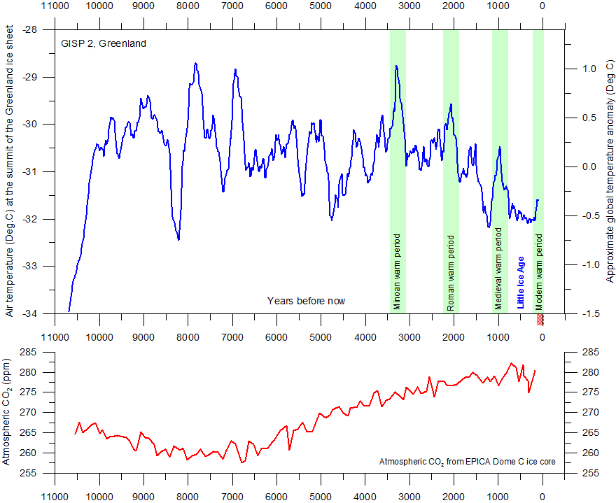
One of the more provocative points arising from the debate over those claims that 2014 was “the hottest year evah” came from the Canadian academic Dr Timothy Ball when, in a recent post on WUWT, he used the evidence of ice-core data to argue that the Earth’s recent temperatures rank in the lowest 3 per cent of all those recorded since the end of the last ice age, 10,000 years ago.
In reality, the implications of such distortions of the data go much further than just representing one of the most bizarre aberrations in the history of science. The fact that our politicians have fallen for all this scary chicanery has given Britain the most suicidally crazy energy policy (useless windmills and all) of any country in the world.
But at least, if they’re hoping to see that “universal climate treaty” signed in Paris next December, we can be pretty sure that it is no more going to happen than that 2014 was the hottest year in history.
How in the universe can you connect any weather or climate event to Human Caused CO2 (Carbon Dioxide)? Atmospheric Carbon Dioxide has been increasing for the last 7,000 years, while the Earth’s Average Temperature has been Decreasing for the last 3,000 years, according to Officially Accepted Ice Cores. See Below.
Humans contribute less than 10% of the recent 10% rise in CO2. CO2 is only 1% of the Greenhouse gas concentration in the atmosphere. This means only 1/10th of 1% of Carbon Dioxide can influence the Earth’s Temperature by human activity. So how else can humans affect the weather? Water Vapor is 97% of the greenhouse gas in Earth’s Atmosphere and makes Clouds, rain, and snow with no help from CO2. Vast amounts of heat is absorbed and released as water evaporates and condenses. This is called “Changing Phases”. It is still H2O (Water) as liquid water, a gas vapor, or solid Ice.
The Sun, Carbon Dioxide, Dust, and Water, including the Oceans are agreed to control temperatures on Earth. The discussion is about the strength of each one and how they work together. An important contributor is the “Greenhouse Gas Effect”.
The chart below shows experimental results of measured heat radiation going into and out of the Earth’s atmosphere. Note the area on the top graph labeled “Infrared” this is the radiation that HEATS surfaces that don’t reflect it. Note that CO2 is only connected to a narrow part of the Infrared (heating) spectrum, while Water Vapor connects across most of it. The red part of the graph is the bandwidth of the Sun’s Solar Irradiance (Brightness). The blue part of the graph is the bandwidth of stored invisible heat radiation upward from the Earth’s surface that originally came from day sunshine. The grey parts of the graph are where the various greenhouse gasses absorb and re-radiate energy. Note the “Hole” in the Water Vapor Grey area just under the Blue. This is the only big part of stored surface heat that is NOT absorbed by water vapor or consumed by evaporation of water to make water vapor. This clearly shows that ONLY water vapor is an important greenhouse gas. CO2 is just a tiny one-hump player. This should be enough proof, but there is much much more.
CO2 is such a weak Greenhouse gas that it is insignificant regardless of the amount of Solar Radiation spectrum it interacts with. Water Vapor rules on its own, because it changes state to water or ice, and back from water or ice, with huge Quantum (instant) heat absorption and release.
Water vapor condenses into water when the air saturates (cannot hold any more) at a normal Earth temperatures. On the other hand, CO2 precipitates (freezes) directly to a solid, or sublimates (evaporates) directly to a gas, without passing through a liquid state, and does this at MINUS 109 degrees Farenheit under normal atmospheric temperature and pressure ranges. CO2 NEVER changes state near the Earth’s surface because it never gets to MINUS 109 degrees anywhere there. Water Vapor near the Earth’s Surface (at lower altitude temperature and pressure) changes state into liquid water = clouds. Clouds are a very high efficiency reflector for Solar infrared radiant energy, reflecting 90%, and shading water and land. However clouds don’t block all radiation, they let non-heating ultraviolet radiation through, giving you a sunburn on a Cloudy day.
Water vapor rises because it is lighter than air. When it rises up into the cold upper air, water vapor condenses into clouds, rain, and snow. When this happens, Clouds radiate huge amounts of heat into space from the condensation of water vapor to water, rain, and ice. Global Surface Temperatures decline with increased Cloudiness because of reflecting white tops and shade the Earth’s surface from the Sun’s warmth. Clouds radiate heat when they form, and they transport vast amounts of heat from the surface to clouds and into space.
Here is the recent relationship between Cloud Cover (Green) and Earth’s Surface Temperature (Blue). It makes sense, doesn’t it? More clouds = cooling. We have all felt the effects.
Huge amounts of Solar radiant energy are needed every day to keep this negative feedback from going to cold. Compare the graph of recent Global Cloudiness below with the next graph of recent Global Temperature. Flip it over, and see if it fits the temperature graph better than the graph of CO2. No contest.
Does the Graph of Cloud Cover explain Global Temperature better than CO2?
Global Temperatures move opposite to Global Cloud Cover. Clouds are condensation from Water Vapor. Clouds release heat into space when they form. Water vapor gets this heat by evaporation, cooling the Earth’s surface. Clouds are 90% efficient at reflecting the sun’s heating radiation into space. CO2 is an orphan. CO2 has no significant role. Water Vapor is not controlled by CO2. Global Water Vapor has stayed almost constant recently, except it has declined at higher altitudes. (See graph below) Higher altitudes are where CO2 Global Warming theory said Water Vapor would increase to do more Greenhouse warming because heat from CO2 put it there. That is the most basic Global Warming assumption. It is clearly not happening. Neither is the predicted warming.
It is apparent that the increased Cloud Cover does not dent the amount of Water Vapor in the atmosphere at lower altitudes (Bottom two lines). This makes sense, because the air has to be saturated with 100% humidity for clouds to form. It cannot get higher than 100%. Any added moisture in the air just drops out as clouds, rain, or snow. Clouds occur almost exclusively at lower altitudes, when the air cannot hold any more water vapor. The excess becomes clouds and rain and ice. The Greenhouse effect of Water Vapor is therefore fairly constant now, on average. The only variable here is the amount of water vapor making clouds. Surface temperatures are controlled by the extent of Cloud Cover, since the Sun’s “Irradiance” is very constant, and only varies by less than 1/4%. Clouds form when the sun heats the Earth’s surfaces. When Cloud Cover is widespread, the Sun’s Energy is reflected back into space. When Cloud Cover is sparce, the land and seas can absorb the Sun’s Energy and the Earth warms. Clouds act as “Venetian Blinds” to block or allow the Sun’s Energy through to heat land and sea. Here is a graph showing that relationship between Solar Energy being sent back into space (Red Line) and the Earth’s Global Temperature (Blue Line). They are opposites.
It seems the prime driver of Global Temperatures is clearly Cloud Cover.
There is now strong evidence that the Sun controls Cloud Cover indirectly by controlling the amount of Cosmic Rays that reach the Earth to make clouds. Here is a graph of that very striking inverse (opposite) relationship of Solar Activity as measured by sunspots (Blue), and cosmic rays. (Red).
It has been shown experimentally in Cloud Chambers, that high energy protons and neutrons that ARE Cosmic Rays, will make cloud formation easier. So, It appears that the Sunspot cycles contribute strongly to the Earth’s global temperature cycles by this indirect method. More sunspots, less Cosmic Rays and less clouds to block the Sun from warming the Earth’s surfaces. Less Sunspots, and more Cosmic Rays get through to make clouds form easier, making shade and reflecting the Sun’s energy back into space, cooling the Earth’s surfaces. So THAT is how the Sun indirectly, but strongly, controls the Earth’s Global Temperature. Here is how it works according to one of the discoverers, Professor Henrik Svensmark.
There is other strong evidence that the Sun’s Activity, as evidenced by Sunspots, controls the Earth’s Global Temperature. During two periods in the last 400 years the sun’s activity went down for several 11-year cycles, resulting in periods of deadly cold for the Earth and Humans. The “Maunder Minimum” lasted for about 60 years with almost no sunspots, a time known as the “Little Ice Age”. Another dip in the Sun’s activity occurred about 200 years ago, known as the “Dalton Minimum”. Although not as long or deep, it, too resulted in thousands of people dying of freezing cold or starvation from not being able to grow crops because of very long winters. One year of low solar activity had no summer at all. In recent times, since about the year 1900, we have had high numbers of Sunspots, and that has resulted in the “Modern Maximum”, where winters are reasonably short and summers long enough to grow food, with some uncomfortably warm periods in the 1890’s and 1930’s, much warmer than today. Note: The hot 1930’s are being denied and covered up by official record keepers (see my blog with detailed graphs). Worldwide Temperature records have been manipulated to lower the temperatures shown in the first half of the 1900s and to raise the temperatures shown since then up to today. See detailed graphs in the Blog entry beginning with HadCRUT. Here is a graph of the Solar Activity sunspot cycles going back 400 years. See the notations for the deadly little ice ages and the recent modern warm period where we have thrived.
The Last two Sunspot cycles before today are numbered #23 and #24. They have peaks that are lower than the preceding peaks by 30% each time. The current Sunspot peak #24 is a “Double Hump”. This same formation happened at the beginning of the long cold Maunder Minimum with almost no sunspots that lasted for 60 years of very cold temperatures on Earth. There is a strong possibility we are headed there again right now. If so, we are not looking at a “Globalwarming” future, but instead, an extended “Globalcooling” period that will be deadly, as it was each of the last times. Here is a graph of the declining Sunspot cycles we ere in.
We are now at the right hand edge of the roller coaster ride, headed for the bottom again. We don’t know if there is a Cycle #25 hump coming, or how big it may be. What we do know is that these low solar activity cycles come around about every 200 years as the Sun’s magnetic poles get “Stuck” in neutral when trying to switch places. This is happening now, right on time, and the Sun has not finished flipping poles as of 2014. In 5 years, it could get stuck trying to flip back. It surely looks to many, many of us like deadly cold weather is ahead for some time, as in the past mini ice ages. Evidence of Global Cooling is all around us. More and more polar ice, Colder and longer Winters, Record low temperatures, even in the Summer. The Modern Little Ice Age may last for 20 years or it may go on for 60 years as it did in the 1600’s. Each new Solar Cycle peak or trough takes 11 years from the last one. The cold caused by lower and lower peaks at Sunspot Cycle #23 and #24 are still unfolding. it can take 11 years for the Earth to change temperature direction and follow the sun This current period of low Solar Activity is called the Landscheidt Grand Minimum, for Theodor Landscheidt, who predicted it back in 1989. He used it to accurately predict global weather. Here is an article on that by Landscheidt himself:
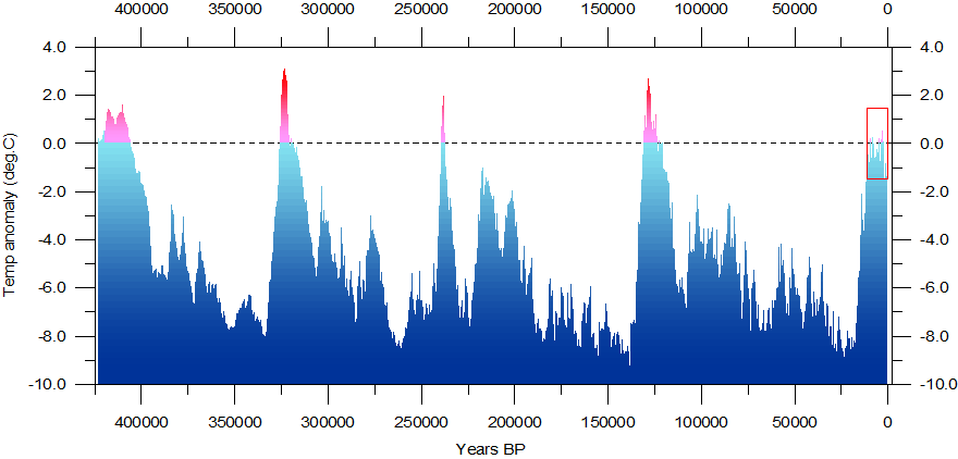
What is worrying some scientists, and me, is what if the amount of Cosmic Rays heading for Earth increase so they are too much even for the Sun to block? The Sun’s solar winds and magnetic fields can only divert just so much of the incoming cosmic rays. Very intense cosmic ray exposure may overcome the Sun’s protection completely. It appears that this is what happens to make deep 100,000 Year ice ages on Earth. Here is a graph of the history going back 420,000 Years. Note the long deep ice ages, and the short warm peaks. We are right now just a speck on the right side of the red box on a warm peak, ready to fall back down into a deep ice age.
Here is a magnification of that red box, showing that we are at the end of it. If we fall off that cliff, the little ice ages we are discussing here will be insignificant. Sheer survival of species, including humans, will be at great risk. The cost of simply keeping warm and finding/making food will be staggering, and societies will be shredded.
An explanation for the great ice ages seems to be as follows, based on astronomy observations. The solar system “Bobs” up and down through the plane of our Galaxy, the “Milky Way”. Right now, we are in the plane of the disc. Because we cannot see very far through the thick middle layer, we are protected from most of the Cosmic rays coming from the other stars in the Milky Way and the supermassive black hole at its center. Our exposure is blocked by nearby stars and gas clouds. This protection only lasts for about 13,000 years, Then the Solar System moves out to clear space where cosmic rays from most of the Milky Way Galaxy can reach us unobstructed.
We seem to be moving out of safety and into the dense stream of cosmic rays that are so strong that our Sun cannot block them. As that happens, the Earth will rapidly cloud over and cool, making the next Ice Age. Ice Ages last about 100,000 years. This effect compounds the Sun’s current inactivity. The little ice age may just tip over right into the next grand ice age for 100,000 years. As a result, we may see a very, very rapid descent into dense cloud cover and even more intense, deadly cold. The Landsheidt Minimum little ice age we are in now will most likely reach the coldest by 2025, and it could stay there for decades as it did in the Maunder Minimum. OR, the sun may come unstuck from it’s state of no magnetic poles and help us warm up first. We are already on the way down the roller coaster ramp. There is a delay of the effect of the sun’s cycles and the Earth’s cooling of approximately one solar cycle. Heating took time. Cooling takes time. Two colder cycles have just occurred. We have not seen the full effects of the past two lower solar cycles. We will not see the full effects for another 11 to 20 years. The recovery of the Sun, after it finishes flipping North and South magnetic poles, may shield us for a while longer, but it seems it will eventually be overpowered by intense cosmic rays. Here is an artists representation of the “Bobbing” of the Earth and Solar System through the plane of the Milky Way.
There is a video on YouTube that goes with this image, but before going there, here is an interesting video on the proposition that we are in a very small galaxy that is colliding with the Milky Way Galaxy, and that could explain the “Bobbing” as we rotate in our own “Saggitarian Galaxy” that is colliding with an arm of the Milky Way galaxy. Seeing this shows the “Bobbing” in s different way.
It is deadly cold we should be preparing for, not a future of uncomfortable warmth whose benefit would be the ability to grow food further towards the Earth’s Poles.
In the meantime, the Atmosphere is getting richer in CO2, and that is plant food. Canadians direct the exhaust from their propane heaters into their greehouses to increase the CO2 and double plant growth. Ironically, today’s rising CO2 levels will actually make it easier to grow food during the upcoming deadly cold with very short summers. CO2 is not a poison, or we would not put it into our soft drinks and carbonated water.
Submarines and the International. Space station keep CO2 levels as high as 4,000 parts par million, or 10 times our atmospheric CO2. Our breath can be as high as 40,000ppm when we exhale. CO2 is not the Devil. It is a green plant’s best friend along with water and sunlight.
I am looking forward to seeing COMPLETE scientific explanations of any connection of the Earths global temperatures with Man Made CO2, WITH PROOF! The grand experiment of looking for it in nature has failed so miserably that the promoters of the story have to alter raw historic records and MAKE warming to keep their cushy salaries and grants totaling about $1Billion per day worldwide. We get NOTHING for it. The truth is we get inconveniences and more expensive basics.. Food, energy, and shelter, to the poorest suffer the most. Please continue to refer to their position as what it is: CO2 Globalwarming. That is their claim. Have them stew in it. Avoid using the term ClimateChange, because we now need that term for the inescapable little ice age we have entered. We really could use some Globalwarming after all, but I would not not count on it, from what I can see.
Now we can see why Australians were the first to throw out the Globalwarming nuts and go back to making life more comfortable and affordable, while caring for their reefs and rainforests with their tax dollars. Putting Billions into the collection plate for the Globalwarming gods stopped making sense when the sermons went off the edge of sensibility, and the weather fixes itself.


